I like clever logos. I don't like complicated, contrived ones.
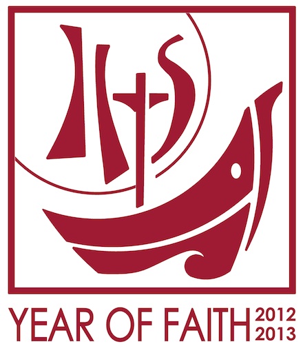
The logo for the Year of Faith 2012 - 2013 is complicated, contrived and....clever.
Never have I seen so many symbols gathered together in one small space contributing to an overall image - that works!
But YoF does it! Congratulations to those involved in its creation.

So, what do you see? A cross, a host, the IHS acronym, and a ship (barque of Peter?) that pulls the whole graphic image together very neatly.
But...can you also see Jonah's whale? Or, is that a graphic too far?
Anyway, the whole concept works (if you study it which you aren't supposed to do with logos).
Hooray and huzzah for something good.
The logo for the Year of Faith 2012 - 2013 is complicated, contrived and....clever.
Never have I seen so many symbols gathered together in one small space contributing to an overall image - that works!
But YoF does it! Congratulations to those involved in its creation.

So, what do you see? A cross, a host, the IHS acronym, and a ship (barque of Peter?) that pulls the whole graphic image together very neatly.
But...can you also see Jonah's whale? Or, is that a graphic too far?
Anyway, the whole concept works (if you study it which you aren't supposed to do with logos).
Hooray and huzzah for something good.

I dunno, Richard; it looks awfully 1968-ish, part of the cultural clutter of felt banners, guitars, and tambourines.
ReplyDelete-- Mack in Texas
Mack, you may be right.....I'm deflated. But, it's better than most of the dross that comes our way.
ReplyDeleteThe logo reminds me of Don Bosco's dream about the two columns (one surmounted by the Host and the other, by a statue of the Virgin) and where the Holy Father steered the ship in the middle of a storm and moored it between the two. Have you heard of it, Richard?
ReplyDeleteGod bless
Sonia
Yes I know of this account Sonia, but had forgotten it. That's another interpretation for the logo.
ReplyDeleteRichard
Thanks, Sonia and Richard; I'll read up on Don Bosco's dream.
ReplyDeleteStill, those awkward graphics...eek.
- Mack in Texas
I spotted the whale!
ReplyDeleteIt's definite LIKE for me...blame it on being a millennial.